INTRODUCTION (3/3) : Let your data speak with Power BI.
Learn how to create a report/dashboard to analyze your data.
Prerequisites for this tutorial:
Have followed the tutorial on Power Automate: Create Your First Automation with Power Automate.
Have followed the tutorial on Power Apps: Create Your First App with Power Apps.
The third pillar of the "Power" software Triforce:
Power BI.
If you've created charts in Excel before, I'll keep it short: it's the same goal, but 1000 times better.
Power BI allows you to visualize your data through charts, text, diagrams, world maps (yes, you read that right), and more.
In practical terms, you can take one of your databases and extract the information you want to know:
What profit was made in a given month?
Which product sold the most in 2023?
How many disputes did we have?
And so on.
Since you've followed the two previous tutorials on Power Automate and Power Apps, you know that we're using a SharePoint list called "Star Wars Data."
We're simply going to use it again!
But before we proceed, let's expand our list to have more data to work with.
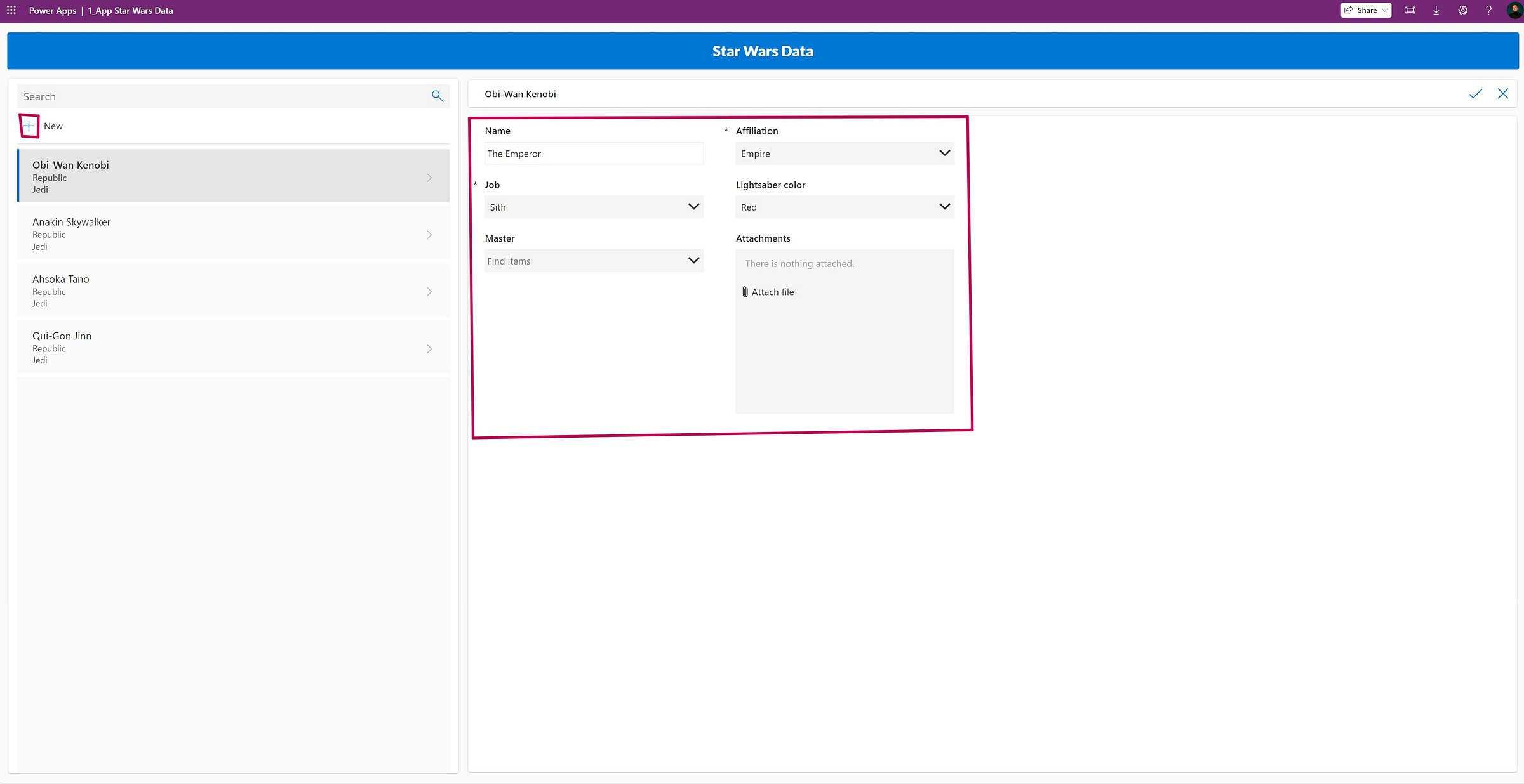
Let's return to our Power Apps application and add new characters, similar to how I showed you for Qui-Gon Jinn in the previous tutorial:
The Emperor
Affiliation: Empire
Job: Sith
Lightsaber color: Red
Master: [Leave it blank]
Dark Vader
Affiliation: Empire
Job: Sith
Lightsaber color: Red
Master: The Emperor
Jango Fett
Affiliation: Separatists
Job: Bounty Hunter
Lightsaber color: [Leave it blank]
Master: [Leave it blank]
Padmé Amidala
Affiliation: Republic
Job: Politician
Lightsaber color: [Leave it blank]
Master: [Leave it blank]
Dark Maul
Affiliation: Separatists
Job: Sith
Lightsaber color: Red
Master: The Emperor
Leia Organa
Affiliation: Rebellion
Job: Politician
Lightsaber color: [Leave it blank]
Master: [Leave it blank]
Add these characters using your application. Your database should look something like this:
Why did I have you add these characters?
Well, our sample size was quite small originally, and while it's still limited, we now have more variations in affiliations, jobs, and lightsaber colors. This will allow us to perform more analyses.
Now, let's install Power BI.
Press the Windows key and type "Microsoft Store."
Click on the application to open the store where we can install Power BI.
Note: If you're in a large organization, you may need to install Power BI through the "Company Portal." The process is similar.
Once you're in the store, search for Power BI in the search bar at the top and select "Power BI Desktop."
My Power BI is already installed, but you can click "Install" on the left side of your screen.
After installation is complete, click "Open" to explore what this software has to offer.
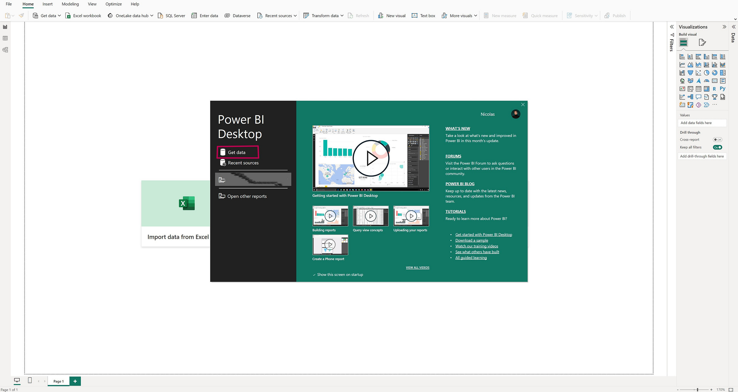
Here's the welcome screen. You can find your previously created reports, or create a new one. You also have access to tutorials if needed. Click "Get Data" at the top-left corner of the window.
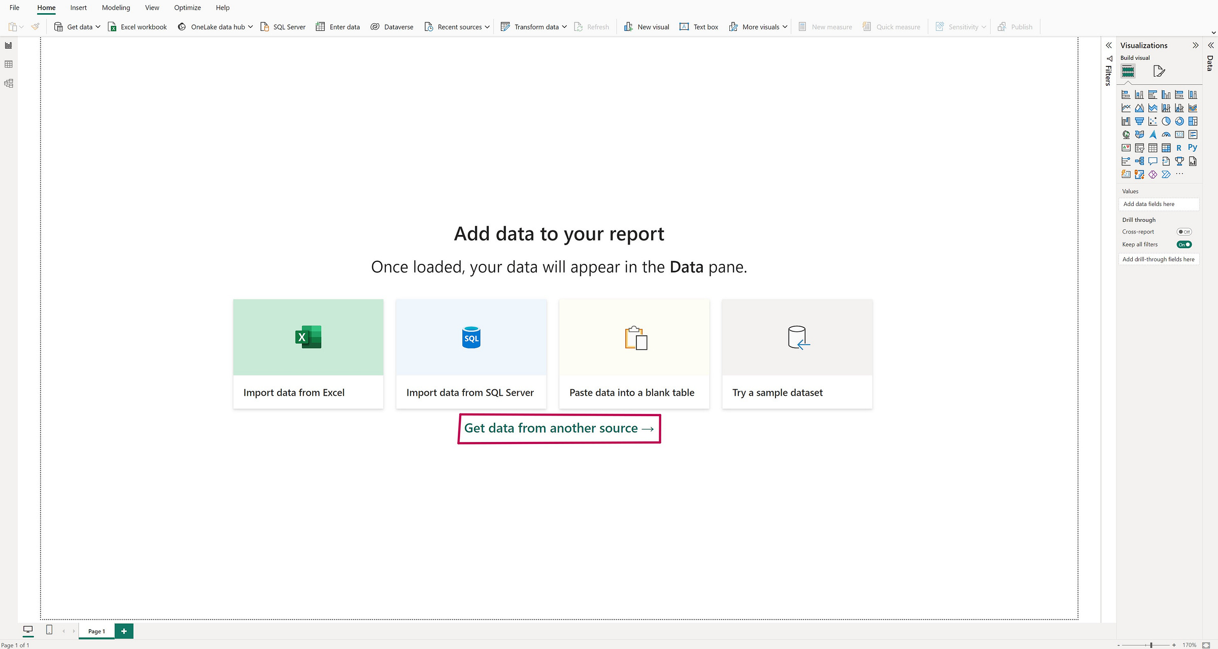
If you accidentally closed the window, relaunch Power BI or simply click "Get Data from Other Sources."
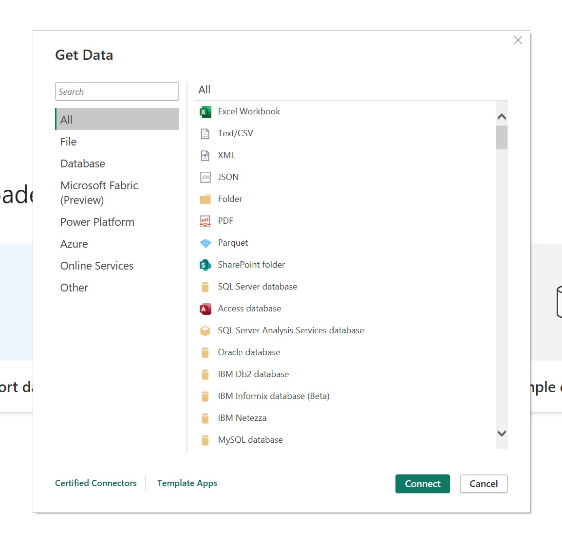
In the new window, you can see that Power BI can connect to a wide range of data sources, including Excel, SQL, SAP HANA, Salesforce, Dataverse, SharePoint lists, and more.
In our case, "Star Wars Data" is a SharePoint list. Look for it in the "Online Services" category, and click "SharePoint Online List" before clicking "Connect."
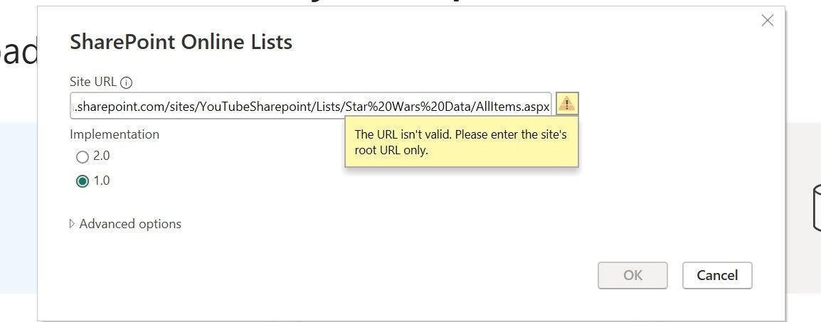
In the window that opens, Power BI asks for the link to your SharePoint site to establish a connection.
Be careful, you shouldn't use just any part of your site's link.
If I use the link that goes directly to the list, Power BI displays an error message saying the link is incorrect.
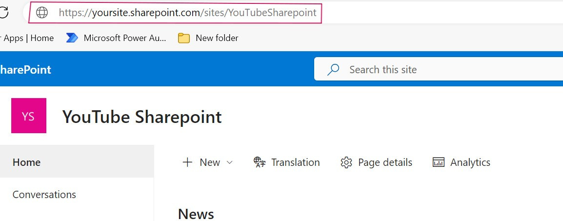
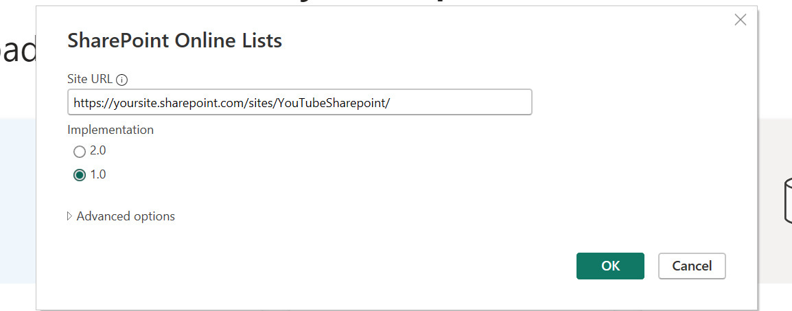
What it needs is the link to your SharePoint site's homepage, which you can easily find by simply being on the main page. Copy and paste it into the Site URL field.
For the use case we're addressing, version 2.0 or 1.0 doesn't make much difference. We'll discuss the implications of this in a future tutorial.
Leave 1.0 selected and click OK.
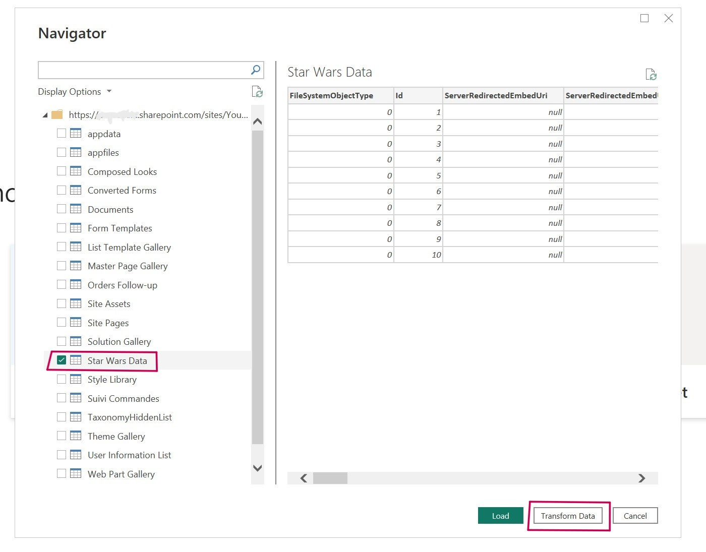
If the address you provided is correct, you should see a window open with many data sources. We'll select the one we want: Star Wars Data.
We could just click "Load" and start creating our reports.
However, you'll discover that many unnecessary columns have been added alongside our original columns.
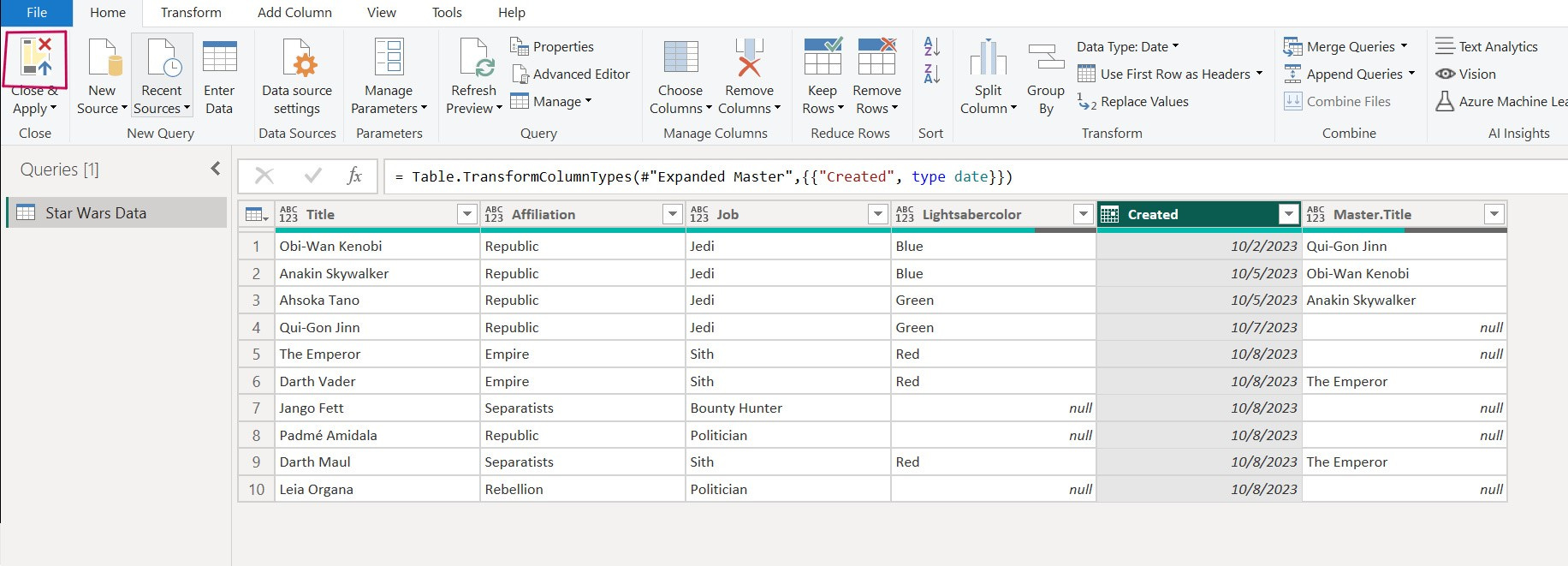
To clean up and make the data more manageable, we'll click "Transform Data."
The new window that opens might look familiar to you – it's Power Query!
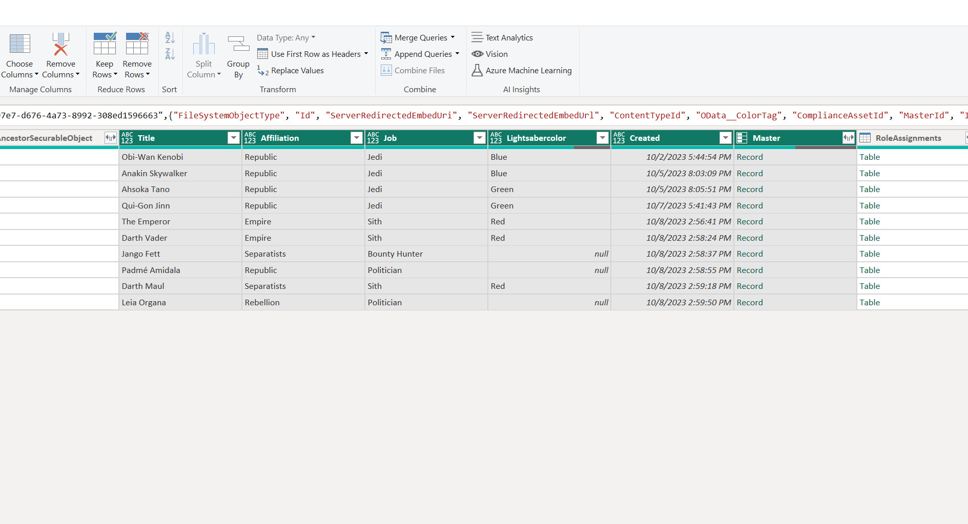
We don't need major data transformations here; we just want to remove unnecessary columns to make our data cleaner. I've counted, and we should keep only 6 columns.
I'll share a little trick to avoid selecting each column we want to get rid of. Let's select the ones we're interested in, which are:
Title
Affiliation
Job
Lightsabercolor
Created
Master (even though the values for this column appear oddly; we'll correct this later).
I recommend aligning the columns side by side, as shown below:
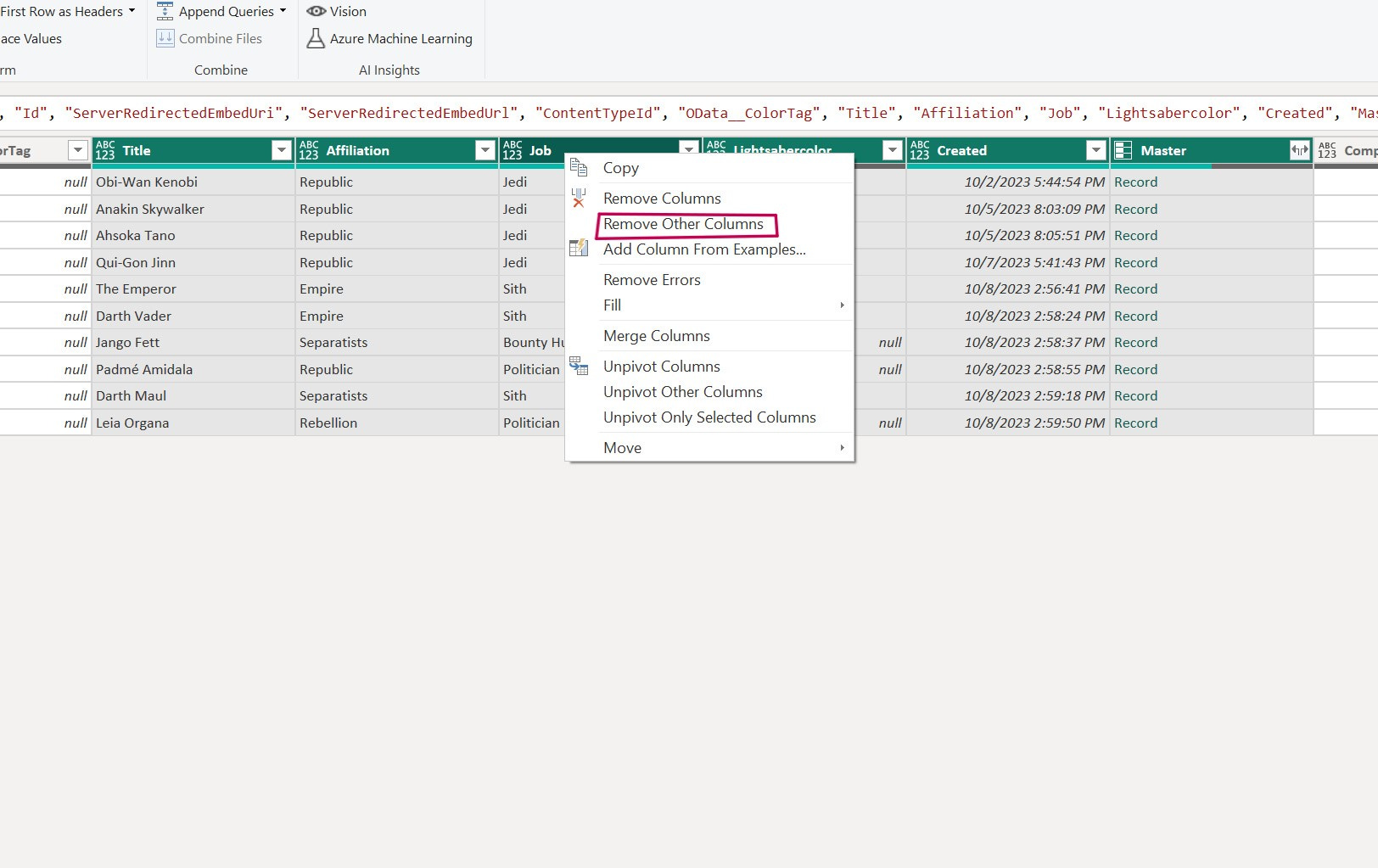
Click on the name of the first column (e.g., Title), then hold down the Ctrl key and click on the names of the other interesting columns simultaneously, as shown below.
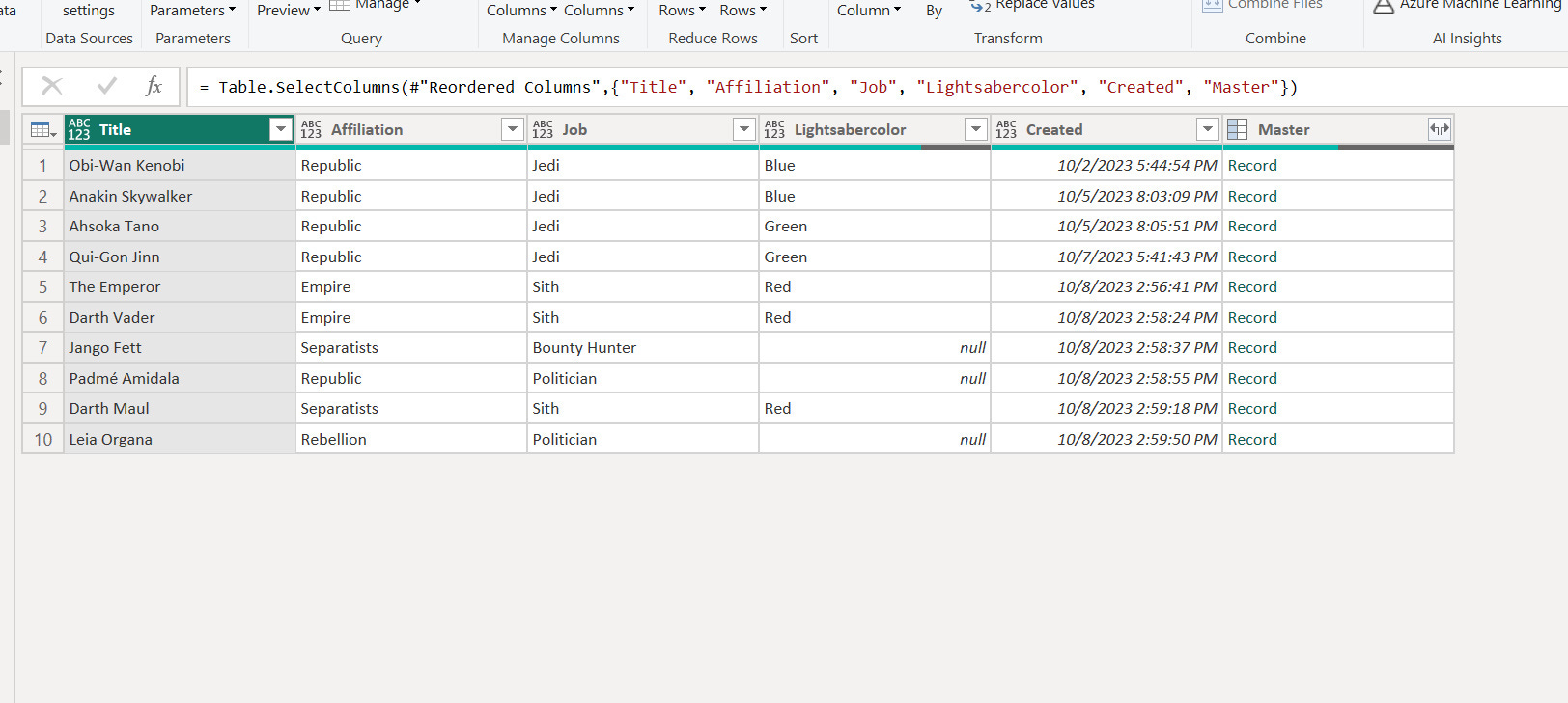
Once they're all selected, right-click on one of the columns and click "Remove Other Columns."
Don't worry, this won't delete anything from our SharePoint list. This action serves as a filter before the data is processed by Power BI.
Now that we have a clearer view, let's address the Master column.
Click on the two arrows to the right of the column. But before choosing the right format, let me explain why this "Record" appears.
The "Master" column is of type "Lookup," and it retrieves information about another character.
However, it doesn't just retrieve the character's name; it can also fetch other information such as affiliation, job, or lightsaber color because the Lookup function can access these details.
The "Record" value means that all the characteristics of the selected master are stored and available.
But what interests us here is only the name, so we'll choose "Title" (the original name of our main "Name" column).
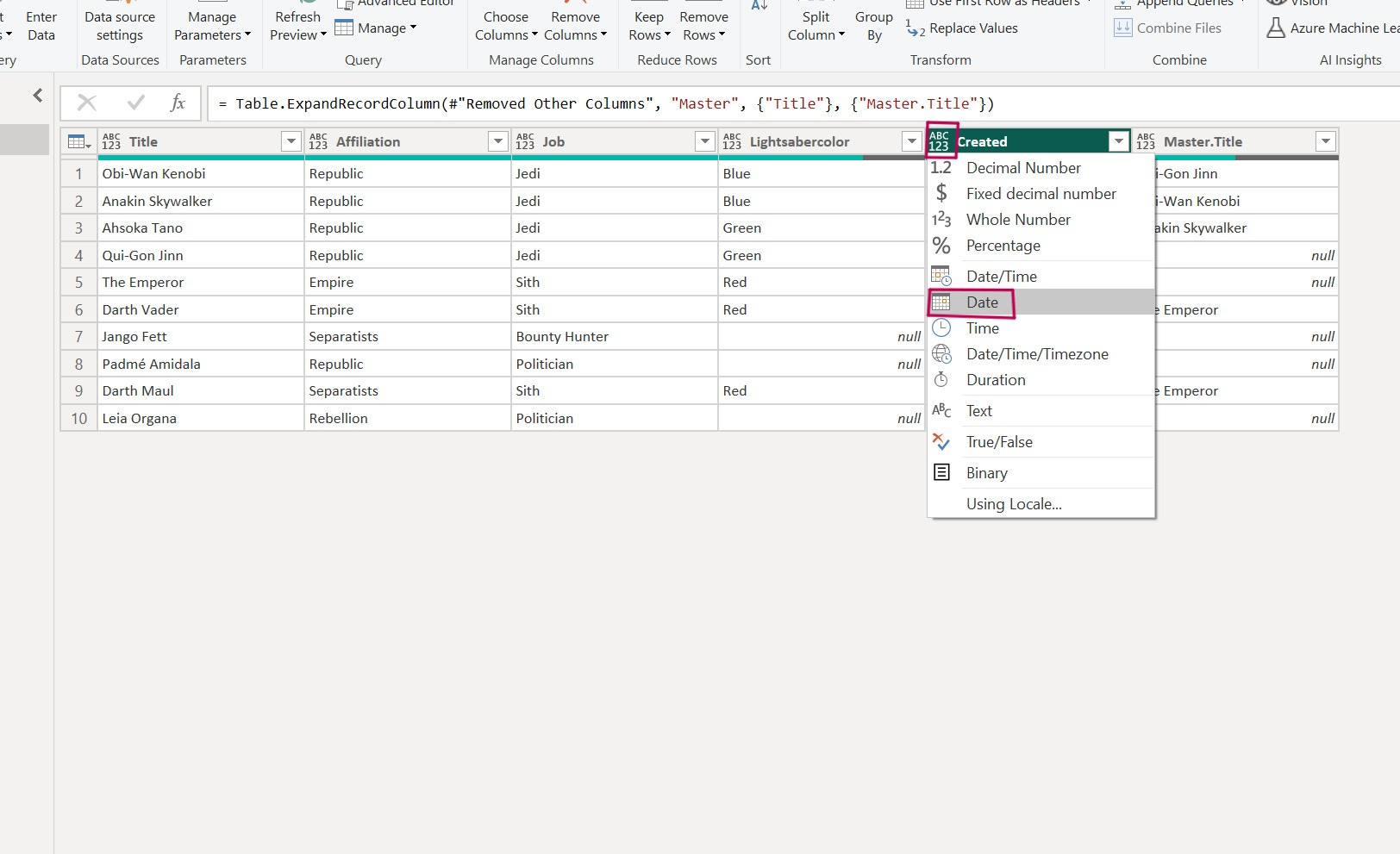
Now, we'd like to change the format of the "Created" column and remove the time.
Click the "ABC 123" button to the left of the "Created" column name, and select "Date" from the dropdown menu.
This will let Power BI know that the "Created" column is a date, not text.
It's important to change the column's format to match its true nature.
For example, if we had a column with only numbers and wanted to perform calculations later, we'd need to convert it to Decimal or Whole Number format.
Click "Close & Apply," and let's start creating our report!
Wait a moment while Power BI establishes connections and filters the data as we requested.
Here we are!
Just like Power Apps and Power Automate, I won't give you a full tour in one tutorial. Today, we'll focus on the right side of Power BI.
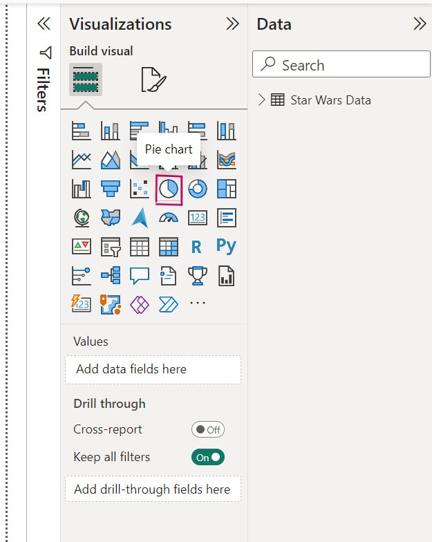
The "Visualizations" section allows you to add different elements to your report.
For example, let's add our first chart. Click on the "Pie Chart".
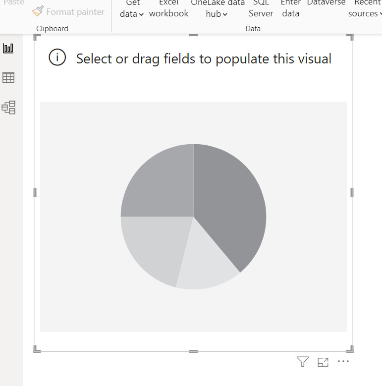
Our chart appears in the report, but it's empty because we haven't associated it with any data yet.
Let's go to the "Fields" section on the far right of Power BI, where you'll find our "Star Wars Data" list. Click the small arrow to the left of the icon, and you'll see the columns we kept earlier. What could we analyze with this chart?
For instance, let's see the number of characters by affiliation.
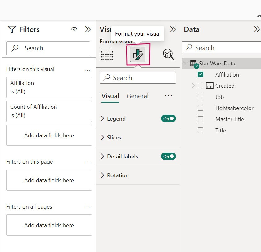
To do this, drag and drop the "Affiliation" line into "Legend" and then again into "Values."
After adding the data, you can see that our chart is a bit more interesting!
Enlarge it to see all the values clearly. We already have some interesting information:
50% of the characters are affiliated to the Republic in our database.
Let's change the format of the chart, especially its title.
"Number of Affiliation by Affiliation" isn't very descriptive.
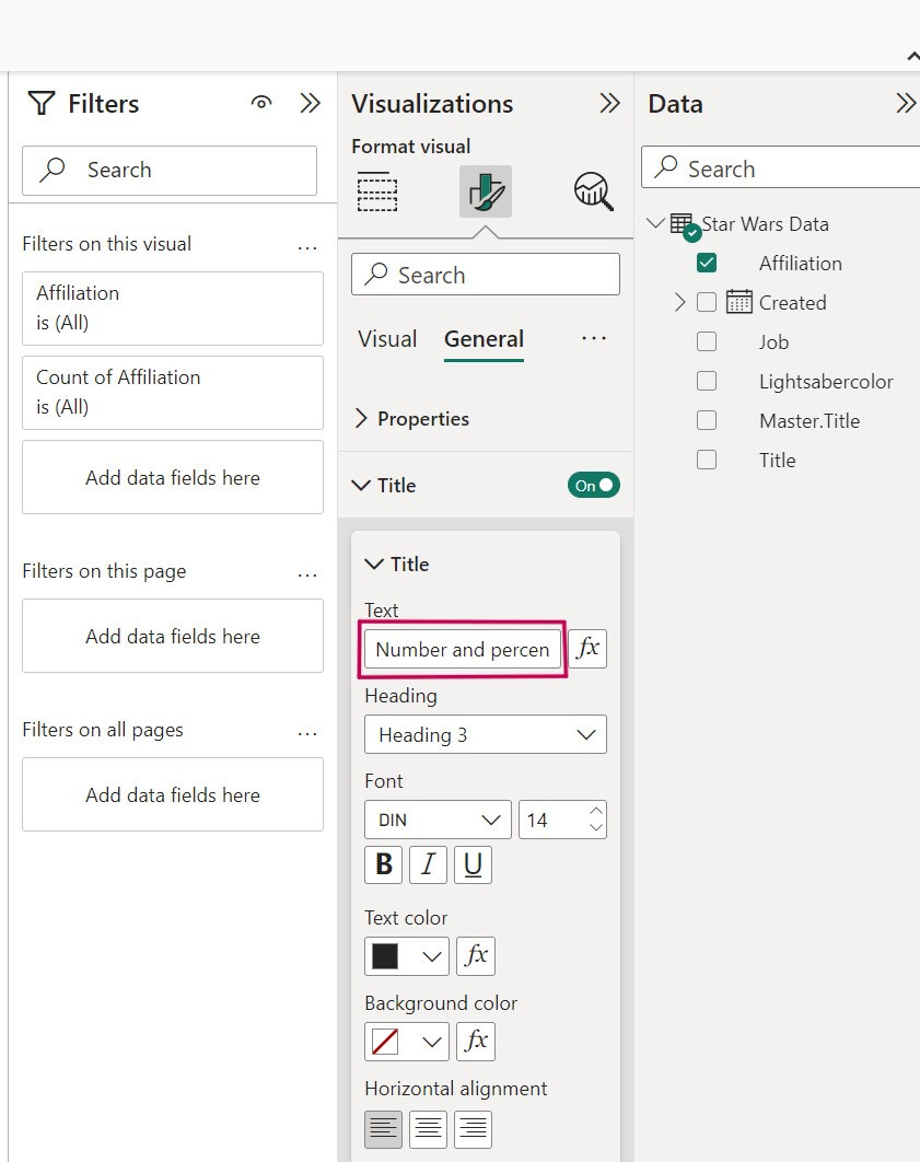
Go to the "Visualizations" section on the right.
Click "Title" under "General."
Replace the default title with "Number and Percentage of Characters in each Affiliation."
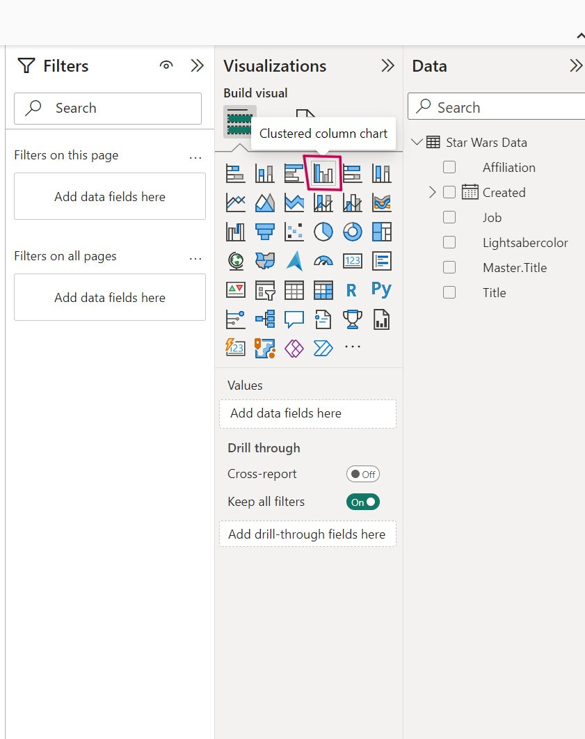
Let's add a second chart, this time a bar chart.
We want to know the distribution of lightsaber colors in our database. Click on the "Clustered Bar Chart."
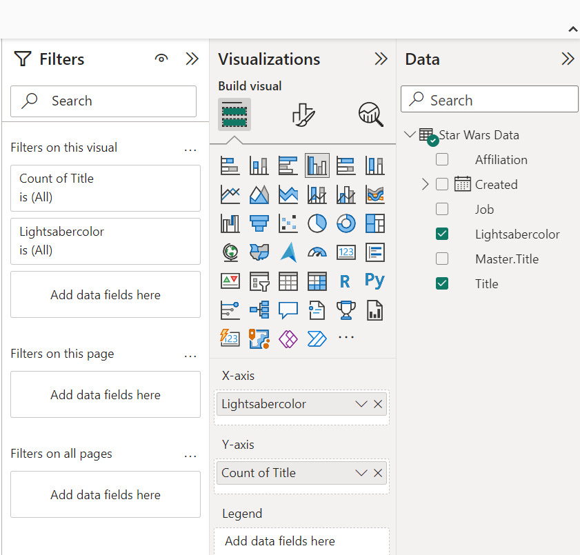
A new empty chart appears. We'll also add the data we want to see in it.
In the "Axis-X" field, add "Lightsabercolor," and in the "Axis-Y" field, add "Title."
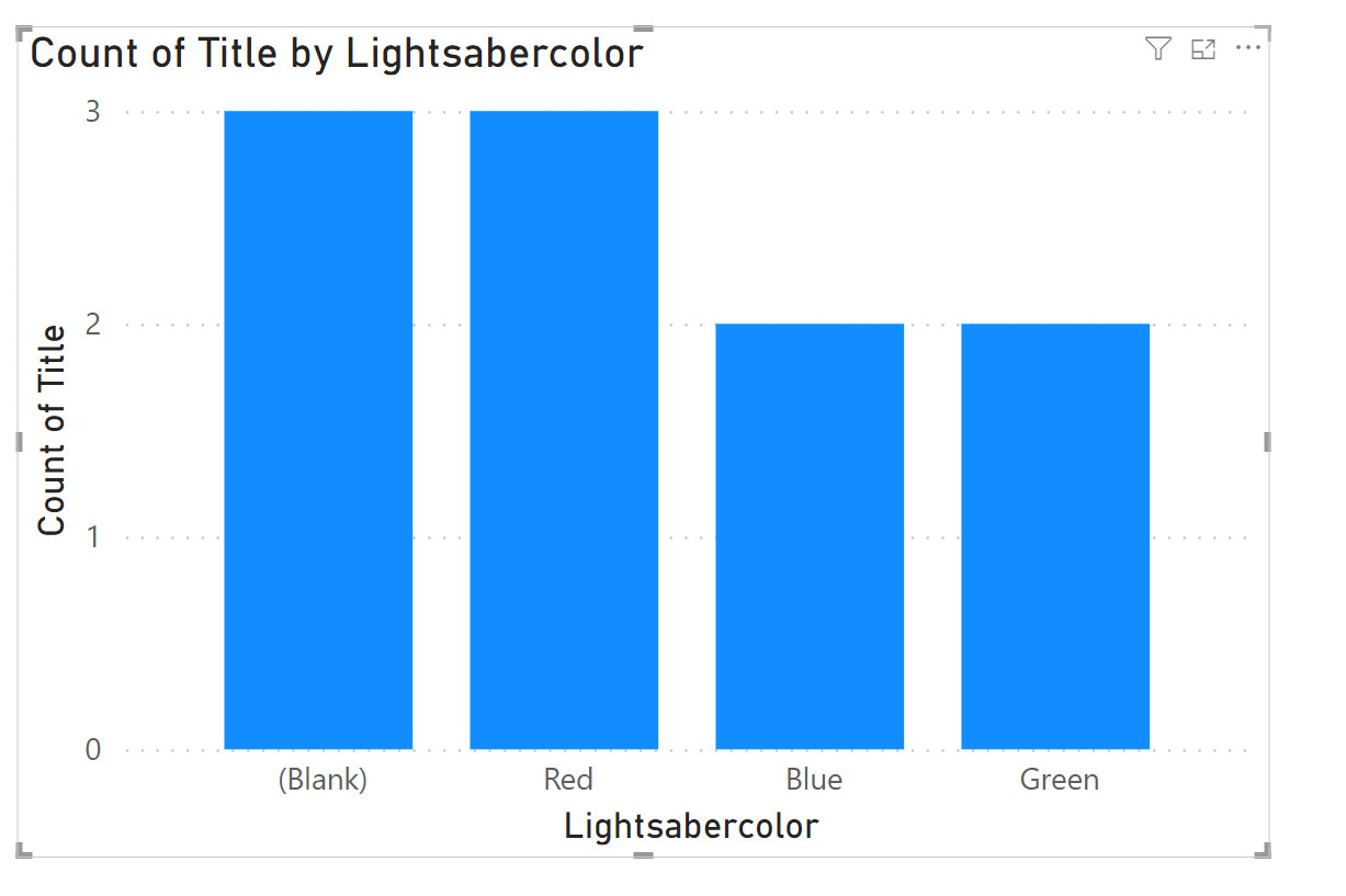
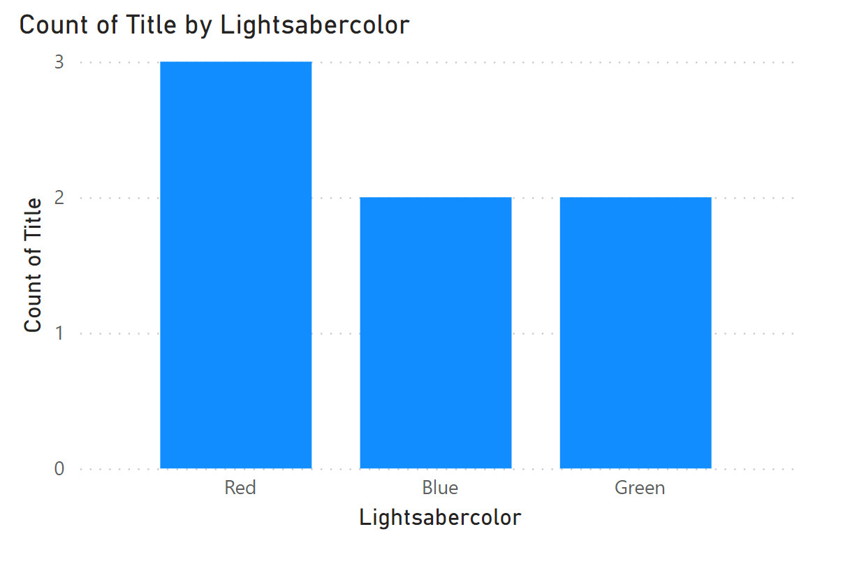
Our chart appears, and we can easily analyze the proportion of lightsaber colors.
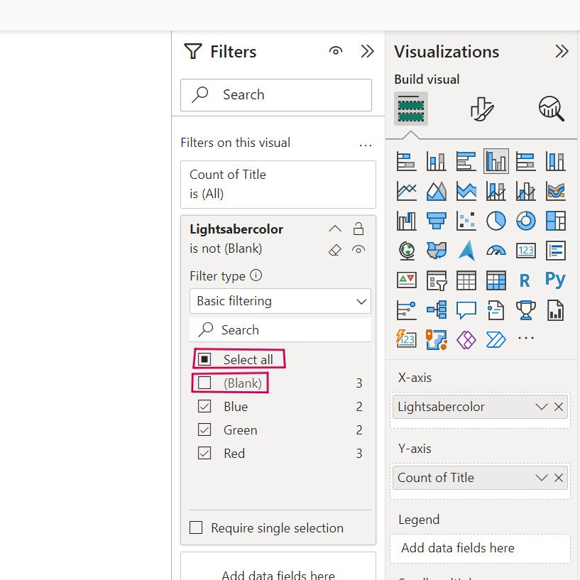
However, we don't want the "(Blank)" value, which represents characters without lightsabers, to appear.
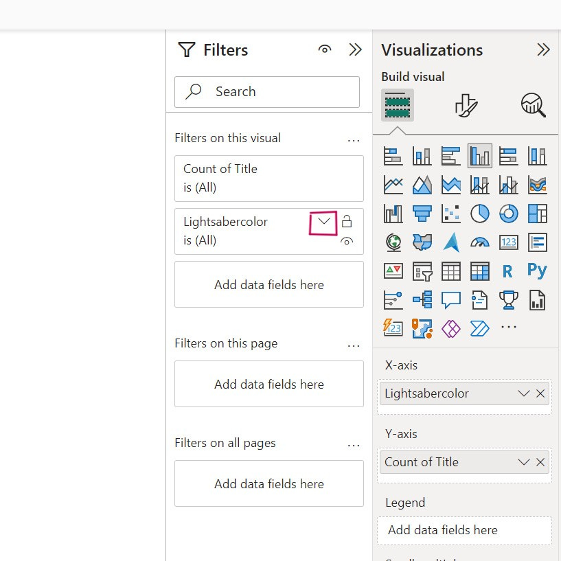
To remove it, apply a filter to the chart. Click on your bar chart to select it and go to the "Filters" section on the right side of the screen.
Here, click the arrow to see the options for the "Lightsabercolor" category.
Click "Select All" and then uncheck "(Blank)." This will remove this value from our chart.
Now we can see that our chart displays only the red, blue, and green colors.
What if we changed the title and the colors of the bars?
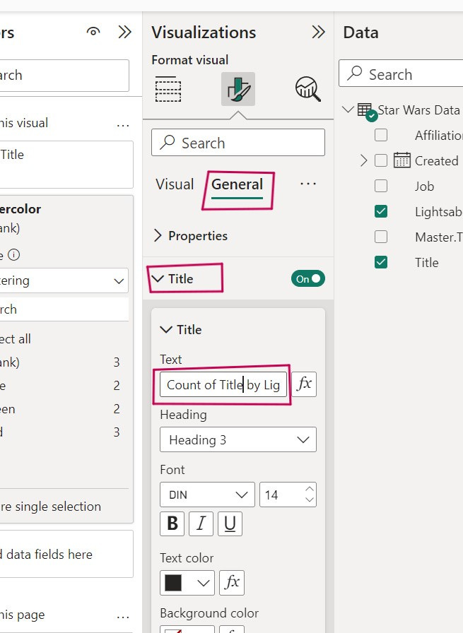
Go to the “Visualization” section after clicking on the chart to select it.
To change the title, let’s do the same thing as we did for the previous chart:
Let's replace it with 'Proportion of Lightsaber Colors'.
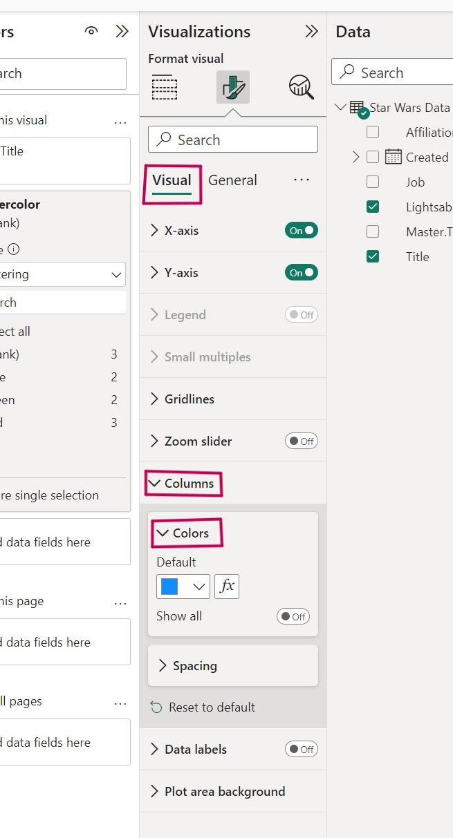
Then, to modify the colors, head to the “Visual” tab.
Click "Columns" and "Colors."
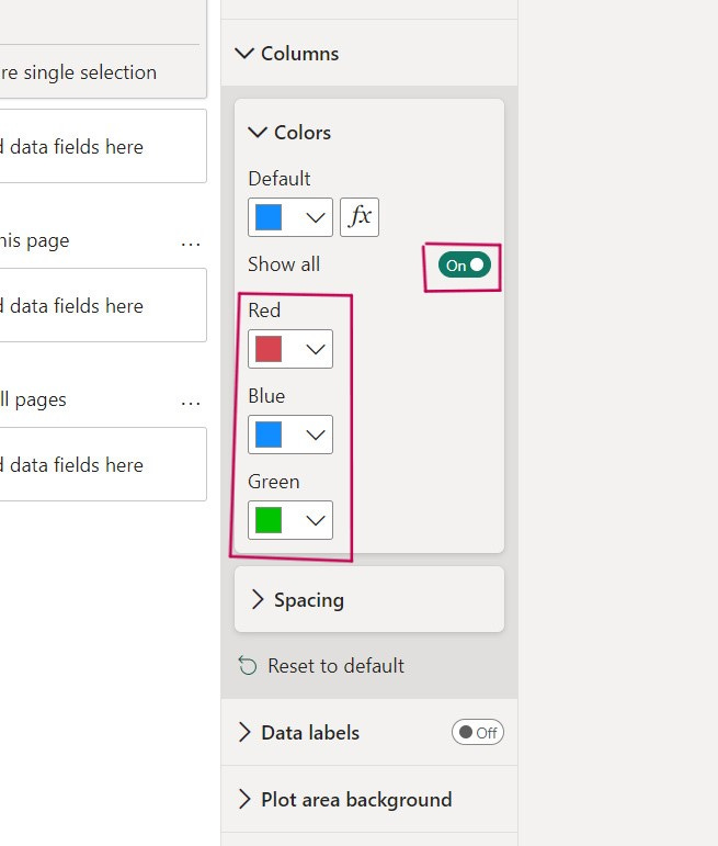
Changing the blue color here would apply the new color to all columns, which we don't want.
Instead, click the button to enable "Show all" and change the colors like this.
Your chart's colors should update automatically, making it more legible.
You can, of course, make other customizations, but we'll cover that in a future tutorial.
For now, let's save and share our report. Click "File" and then "Save As."
Name it starwarsdatareport for example, and save it in a folder on your computer.
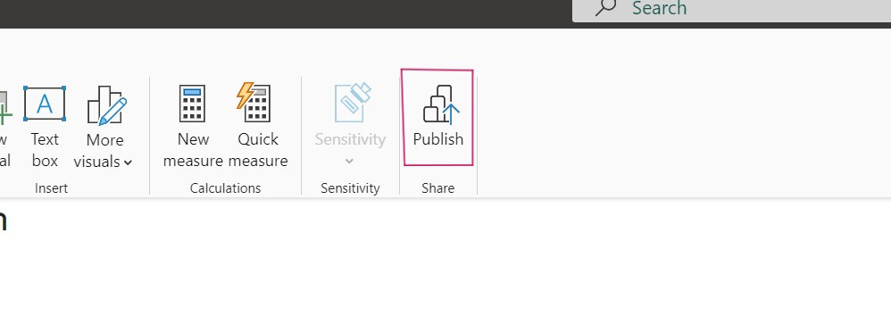
To share it with your colleagues, simply click "Publish" in Power BI, located in the "Home" tab of the ribbon.
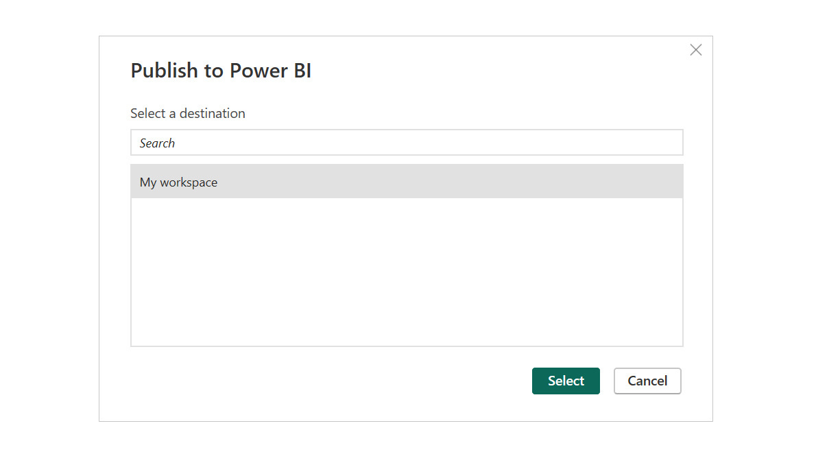
I recommend saving it in "My Workspace" as shown below. Your organization may already have online folders; if that's the case, you can save it in one of those folders based on their recommendations.
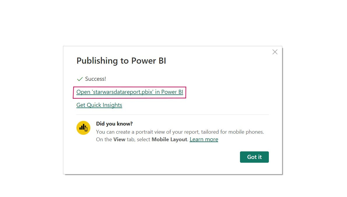
Wait a moment, and then click "Open reportstarwarsdata.pbix in Power BI."
This will take you to the cloud part of the software, "Power BI online," mainly used for sharing and visualization.
The desktop part (Power BI Desktop, which I had you install on your PC) is reserved for report construction and modification. You'll find both your charts here.
If you click on one of the segments, you'll see that the other chart also displays the corresponding data.
For instance, I selected the Empire values in the pie chart, and I can also see the number of red lightsabers in the bar chart for Empire characters.


